


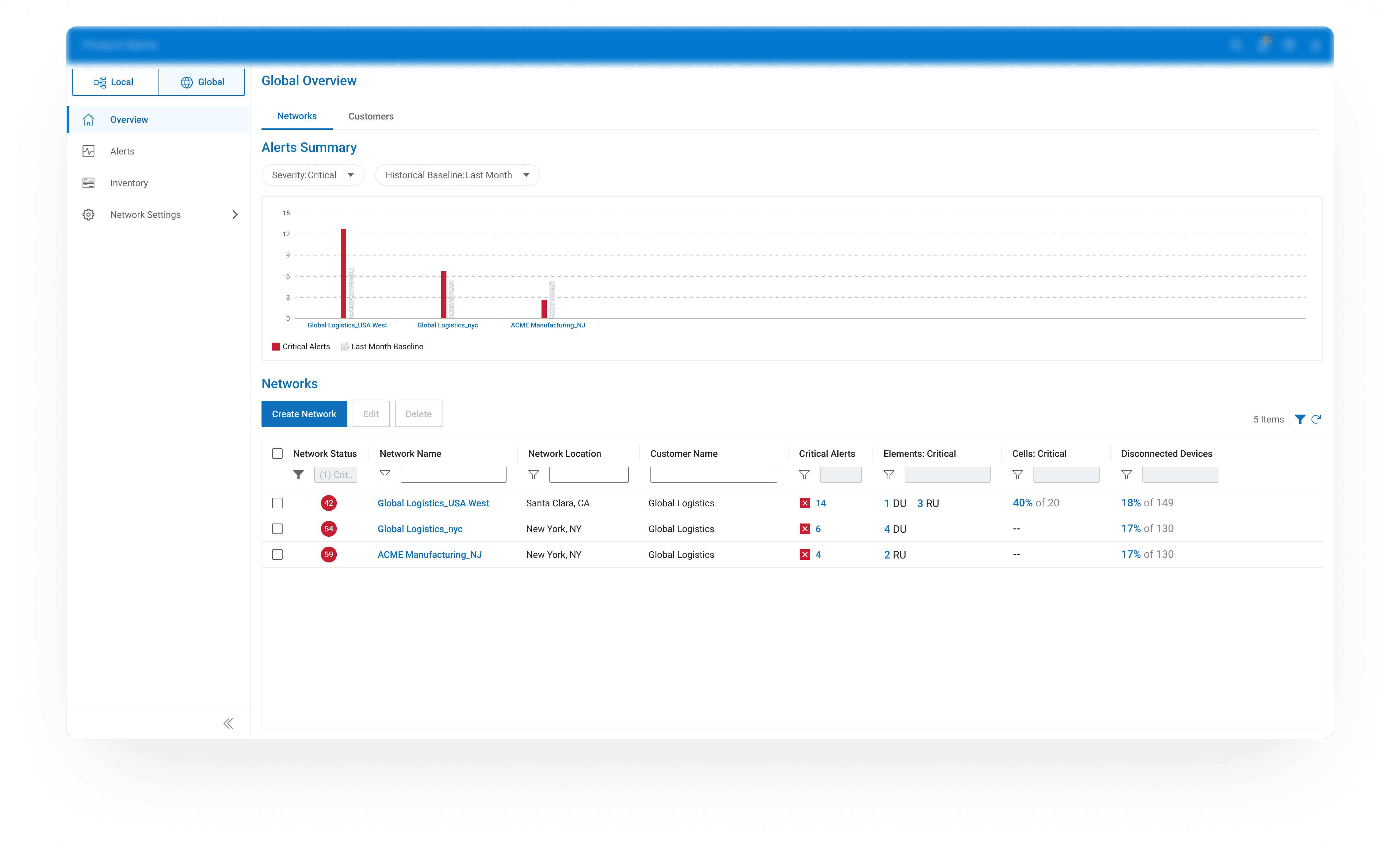
60% of Participants Couldn’t Tell the Network Status Quickly
In testing, over half of users couldn’t tell if the network was healthy. The screen overflowed with metrics, graphs, and colors, but none told a clear story. One engineer said it best: “I don’t know if this is good or bad…I’d rather just check the Alerts page.”


More Information Meant More Uncertainty
To pinpoint where confusion started, I traced how engineers actually read dashboards under pressure. They scan for signals, not numbers. This led me to shift the goal: from showing everything accurately to communicating what’s important instantly.
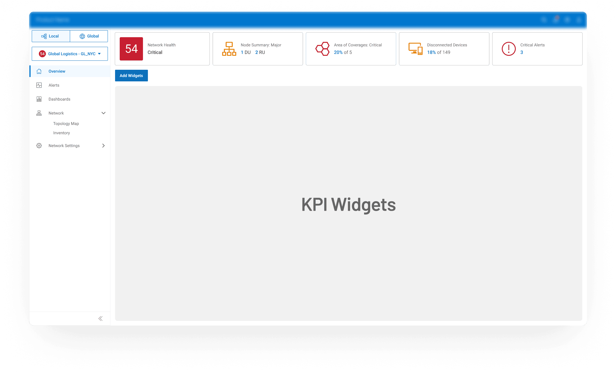
Simplifying Without Losing Meaning
I redefined the visualization rules: using red only to flag severity and introducing a three-tier widget system aligned with users’ jobs-to-be-done.
Small: instant monitoring KPIs
Medium: recognizing pattern
Large: deep analysis (Analysis Page)
This hierarchy brought visual calm and helped users focus on the right level of detail at the right time.
Designing for Real Data: Handling Missing Information
Real data isn't perfect. When I tested my design with live samples, frequent "NaN" appeared without explanation.
To prevent misinterpretation, I explored 3 visual options and discovered that texture communicates better than color alone.
The final solution used a diagonal-hatched gray bar to indicate missing segments. Users appreciated finally knowing when “no data” simply meant no data, not system failure.


User Pain Point

Finding the Real Problem Behind Messy Dashboard
User testing revealed that engineers didn’t lack data, they lacked guidance. They opened the dashboard expecting a quick pulse check but instead found themselves decoding numbers. What they needed was not more metrics but immediate clarity.

Defining What "Matters Most" & Iterating for MVP
Early conversations focused on “showing more metrics.” I reframed the discussion toward clarity over quantity. Collaborating with PMs and UXR, we defined what indicates health, what signals risk, and what requires immediate attention.
This reframed the Insight Bar from a static display to a decision layer that communicates context and urgency.


Defining Two Complementary Views
Instead of compromising on a single layout, I proposed separating experiences while keeping them visually connected. Through working sessions with PMs, engineers, and UXR, we outlined what each role must see first, what could be optional, and how to maintain consistency across both views.


4.9/5
Satisfaction Score
90%
Task Complete Rate
+40%
Faster Recognition