How I Simplify Troubleshooting for IT Users by Mapping Invisible 5G Networks
How I Simplify Troubleshooting for IT Users by Mapping Invisible 5G Networks
0 -> 1
0 -> 1
Enterprise UX
Enterprise UX
Research-Driven
Research-Driven
~ 10 mins Read
~ 10 mins Read
Why This Matter?
When network downtime can cost $1.4 million an hour, IT teams were wasting time juggling 5+ siloed systems to trace the root cause 🤯
Why This Matter?
When network downtime can cost $1.4 million an hour, IT teams were wasting time juggling 5+ siloed systems to trace the root cause 🤯
Why This Matter?
When network downtime can cost $1.4 million an hour, IT teams were wasting time juggling 5+ siloed systems to trace the root cause 🤯
Why This Matter?
When network downtime can cost $1.4 million an hour, IT teams were wasting time juggling 5+ siloed systems to trace the root cause 🤯
Why This Matter?
When network downtime can cost $1.4 million an hour, IT teams were wasting time juggling 5+ siloed systems to trace the root cause 🤯
Challenges
Limited Domain Knowledge
Constantly Evolving Architecture
Unclear Scope & Messy Process
Challenges
Limited Domain Knowledge
Constantly Evolving Architecture
Unclear Scope & Messy Process
Challenges
Limited Domain Knowledge
Constantly Evolving Architecture
Unclear Scope & Messy Process
Challenges
Limited Domain Knowledge
Constantly Evolving Architecture
Unclear Scope & Messy Process
Challenges
Limited Domain Knowledge
Constantly Evolving Architecture
Unclear Scope & Messy Process
My Contributions
Ran weekly co-designs to align teams
Iterated design after 3 rounds of testing
Prioritized must-have and set the roadmap
My Contributions
Ran weekly co-designs to align teams
Iterated design after 3 rounds of testing
Prioritized must-have and set the roadmap
My Contributions
Ran weekly co-designs to align teams
Iterated design after 3 rounds of testing
Prioritized must-have and set the roadmap
My Contributions
Ran weekly co-designs to align teams
Iterated design after 3 rounds of testing
Prioritized must-have and set the roadmap
My Contributions
Ran weekly co-designs to align teams
Iterated design after 3 rounds of testing
Prioritized must-have and set the roadmap
Overview
Overview


IT teams were racing the clock, toggling between 5+ siloed tools, and struggling to explain changes to teammates who often lacked the same context.
IT teams were racing the clock, toggling between 5+ siloed tools, and struggling to explain changes to teammates who often lacked the same context.
Define Problem
Define Problem
The Broken Reality of 5G Network Troubleshooting
The Broken Reality of 5G Network Troubleshooting
Digging into 50+ Hours of Interview with Network Ops Teams to Map the "As-is"
Partnering with UX researchers, we distilled insights from 20+ real-world use cases and found a common frustration: fixing network issues was messy and slow.

Real-world Use Cases. Details are intentionally vague due to NDA - contact me for more context
Real-world Use Cases. Details are intentionally vague due to NDA - contact me for more context
Real-world Use Cases. Details are intentionally vague due to NDA - contact me for more context
Keeping 5G networks up and running is critical for enterprises, yet IT teams faced scattered, static, and overly complex tools.
"I need at least 4 screenshots from colleagues at NOC to understdand device relationships."

Justin
On-site Engineer Filing Tickets
"I need at least 4 screenshots from colleagues at NOC to understdand device relationships."
Justin
On-site Engineer Filing Tickets
"I need at least 4 screenshots from colleagues at NOC to understdand device relationships."
Justin
On-site Engineer Filing Tickets
"Many tools don’t reflect real-time changes…I have to ask our on-site guys to confirm."

Tim
IT Engineers Resolving 80% of Tickets
"Many tools don’t reflect real-time changes…I have to ask our on-site guys to confirm."
Tim
Network ITs with Some 5G experience
"Many tools don’t reflect real-time changes…I have to ask our on-site guys to confirm."
Tim
IT Engineers Resolving 80% of Tickets
"Finding the root cause of a tower outage means digging through 100+ device."

Molly
Admin Handling 20% Escalations
"Finding the root cause of a tower outage means digging through 100+ device."
Molly
Network Admin with Advanced 5G Experience
"Finding the root cause of a tower outage means digging through 100+ device."
Molly
Admin Handling 20% Escalations
Section 01
Section 01
HMW Unify Multi-layered Information into a Single Map View?
HMW Unify Multi-layered Information into a Single Map View?

At First, Stakeholders Wanted Everything on One Screen
I explored different ways of combining multiple layers of information and shared them with stakeholders. They preferred the 1st option because it showed everything and seemed flexible.

But Users Focused on One View, Then Switched
User flow analysis showed engineers troubleshoot progressively: software → hardware, broad → granular. The all-in-one-page design overwhelmed rather than guided.

Solution
Seamless Toggle Between Dual Map Views
+
Fixed Panel for Extra Details

Solution
Seamless Toggle Between Dual Map Views
+
Fixed Panel for Extra Details
Solution
Seamless Toggle Between Dual Map Views
+
Fixed Panel for Extra Details
Section 02
Section 02
HMW Design Dynamic, Simplified Visuals that Present Right Information at the Right Time
HMW Design Dynamic, Simplified Visuals that Present Right Information at the Right Time
User Pain Point
Static, overly technical visuals left users struggling to see how things were connected.
Static, overly technical visuals left users struggling to see how things were connected.

But, No Competitor Applied This Insight
We then researched 3 popular network map tools and found all of them used a horizontal layout, which conflicted with what research revealed.

“No More Horizontal!”
During an observational study, we noticed a clear pattern: IT Engineers think in a vertical structure.
"We always check downstream connections to understand the impact on our customers."
"Our customers only care about downstream issues that affect their ability to stay connected."
"The first thing I check is the upstream connections to identify a root cause."
Designing Vertical Structure & Verifying With Users
With research insights, I designed Network Map in a Vertical Structure because it aligns with users' Top-Down mindset and is easy to develop and scale up.
In the following user testing, 100% of participants praised the clarity of the vertical structure. However, about 60% expressed concerns about identifying connections, noting that overlapping lines could become confusing.

When Design Hit a Wall, Collaboration Opened It
Iterating the design of complex connections created visual chaos and technical limits.
Instead of compromising, I hosted a co-design workshop with 10 engineers. Together we simplified the logic and added progressive exposure.

Iteration process of 5G-CU-DU relationship design
Iteration process of 5G-CU-DU relationship design
Iteration process of 5G-CU-DU relationship design
Solution
Seamless Toggle Between Dual Map Views
+
Fixed Panel for Extra Details
Solution
Seamless Toggle Between Dual Map Views
+
Fixed Panel for Extra Details

Section 03
Section 03
HMW Design a Scalable Layout that Adapts As Networks Expand in the Future.
HMW Design a Scalable Layout that Adapts As Networks Expand in the Future.

Exploring Alternatives & Making Decision in Short Time
As I tackled the challenge of scalability, I reviewed the design decisions made for other parts of the Network Map and revisited a key research insight: Context is key, but not all context is needed at once.
From earlier testing, I knew network engineers don’t need all nodes visible at once - they focus on urgent issues and tackle them step by step.
#1 Listing All Nodes in One Line

Clean layout, easy to develop.
Even when zoomed out, only 15 nodes fit on a screen, forcing users to pan across the map to see the rest.
#1 Listing All Nodes in One Line
Clean layout, easy to develop.
Even when zoomed out, only 15 nodes fit on a screen, forcing users to pan across the map to see the rest.
#1 Listing All Nodes in One Line
Clean layout, easy to develop.
Even when zoomed out, only 15 nodes fit on a screen, forcing users to pan across the map to see the rest.
#1 Listing All Nodes in One Line
Clean layout, easy to develop.
Even when zoomed out, only 15 nodes fit on a screen, forcing users to pan across the map to see the rest.
#1 Listing All Nodes in One Line
Clean layout, easy to develop.
Even when zoomed out, only 15 nodes fit on a screen, forcing users to pan across the map to see the rest.
#2 Displaying Critical Only

Allows nodes to be arranged in multiple rows, reducing clutter.
Hard to develop—the library found by front-end team didn’t support this approach.
#2 Displaying Critical Only
Allows nodes to be arranged in multiple rows, reducing clutter.
Hard to develop—the library found by front-end team didn’t support this approach.
#2 Displaying Critical Only
Allows nodes to be arranged in multiple rows, reducing clutter.
Hard to develop—the library found by front-end team didn’t support this approach.
#2 Displaying Critical Only
Allows nodes to be arranged in multiple rows, reducing clutter.
Hard to develop—the library found by front-end team didn’t support this approach.
#2 Displaying Critical Only
Allows nodes to be arranged in multiple rows, reducing clutter.
Hard to develop—the library found by front-end team didn’t support this approach.
#3 Showing a List View of Nodes

Easy to develop and scale-up.
Didn’t align with the goal of providing a large interactive map for users to visually navigate the network.
#3 Showing a List View of Nodes
Easy to develop and scale-up.
Didn’t align with the goal of providing a large interactive map for users to visually navigate the network.
#3 Showing a List View of Nodes
Easy to develop and scale-up.
Didn’t align with the goal of providing a large interactive map for users to visually navigate the network.
Solution
A Scrollable "5-Node Window"
+
Donut Charts for Overview

Solution
A Scrollable "5-Node Window"
+
Donut Charts for Overview
Solution
A Scrollable "5-Node Window"
+
Donut Charts for Overview
Getting Aligned on Priorities & Defining Roadmap
These design can't be implemented in one release. Closely worked with Products and Engineers teams, we got alignment on priorities and broke down the huge feature into 3 phases:
Phase 1: framework + basic functions
Phase 2: granular views + extra details
Phase 3: advanced troubleshooting
Key troubleshooting flow & All the Information that User Needs
Key troubleshooting flow & All the Information that User Needs

Roadmap - Getting Aligned on Priorities with PMs & Engineers
Roadmap - Getting Aligned on Priorities with PMs & Engineers
Results & Impacts
Results & Impacts
Launched & Secured the clients who praised our solutions
Launched & Secured the clients who praised our solutions

Final Delivery: 3 Tailored Versions + Detailed Design Documentation
Final Delivery: 3 Tailored Versions + Detailed Design Documentation
100%
User Satisfaction
-80%
Reduced Tool-Switching
85%
Task Completion
Concept ⇒ Delivery
From concept to development, I collaborated across teams to design and deliver 3 tailored versions aligned with user roles and product lifecycle needs.
Concept ⇒ Delivery
From concept to development, I collaborated across teams to design and deliver 3 tailored versions aligned with user roles and product lifecycle needs.
Concept ⇒ Delivery
From concept to development, I collaborated across teams to design and deliver 3 tailored versions aligned with user roles and product lifecycle needs.
Positive User Feedback
In the final round of user testings, participants from real telco industry noted that the design made the network relationships easier to understand and act on.
Positive User Feedback
In the final round of user testings, participants from real telco industry noted that the design made the network relationships easier to understand and act on.
Positive User Feedback
In the final round of user testings, participants from real telco industry noted that the design made the network relationships easier to understand and act on.
Launch & Early Win!
After launching the trial version in 2024, we secured our first client purchase order - a strong early win that validated the design and energized the team.
Launch & Early Win!
After launching the trial version in 2024, we secured our first client purchase order - a strong early win that validated the design and energized the team.
Launch & Early Win!
After launching the trial version in 2024, we secured our first client purchase order - a strong early win that validated the design and energized the team.
Design Adopted Across Products, Streamlining Cross-functional Collaboration
Design Adopted Across Products, Streamlining Cross-functional Collaboration

Feedback and recognition from product, engineering, and UX partners reflecting strong collaboration and design influence.
Feedback and recognition from product, engineering, and UX partners reflecting strong collaboration and design influence.
3x
Products Adoption
-50%
Less Feedback Loops
Design Adopted by Others
The scalable topology design patterns were referenced by 3 other products, enhancing design consistency across product ecosystems.
Design Adopted by Others
The scalable topology design patterns were referenced by 3 other products, enhancing design consistency across product ecosystems.
Design Adopted by Others
The scalable topology design patterns were referenced by 3 other products, enhancing design consistency across product ecosystems.
Earn Trust & Smooth Design-Dev Handoff
Earned trust from PMs and engineers, who began involving UX early in release planning.
Streamlined design handoff with lean documentation, reducing feedback cycles and speeding up delivery.
Earn Trust & Smooth Design-Dev Handoff
Earned trust from PMs and engineers, who began involving UX early in release planning.
Streamlined design handoff with lean documentation, reducing feedback cycles and speeding up delivery.
Earn Trust & Smooth Design-Dev Handoff
Earned trust from PMs and engineers, who began involving UX early in release planning.
Streamlined design handoff with lean documentation, reducing feedback cycles and speeding up delivery.
What Comes Next?
What Comes Next?
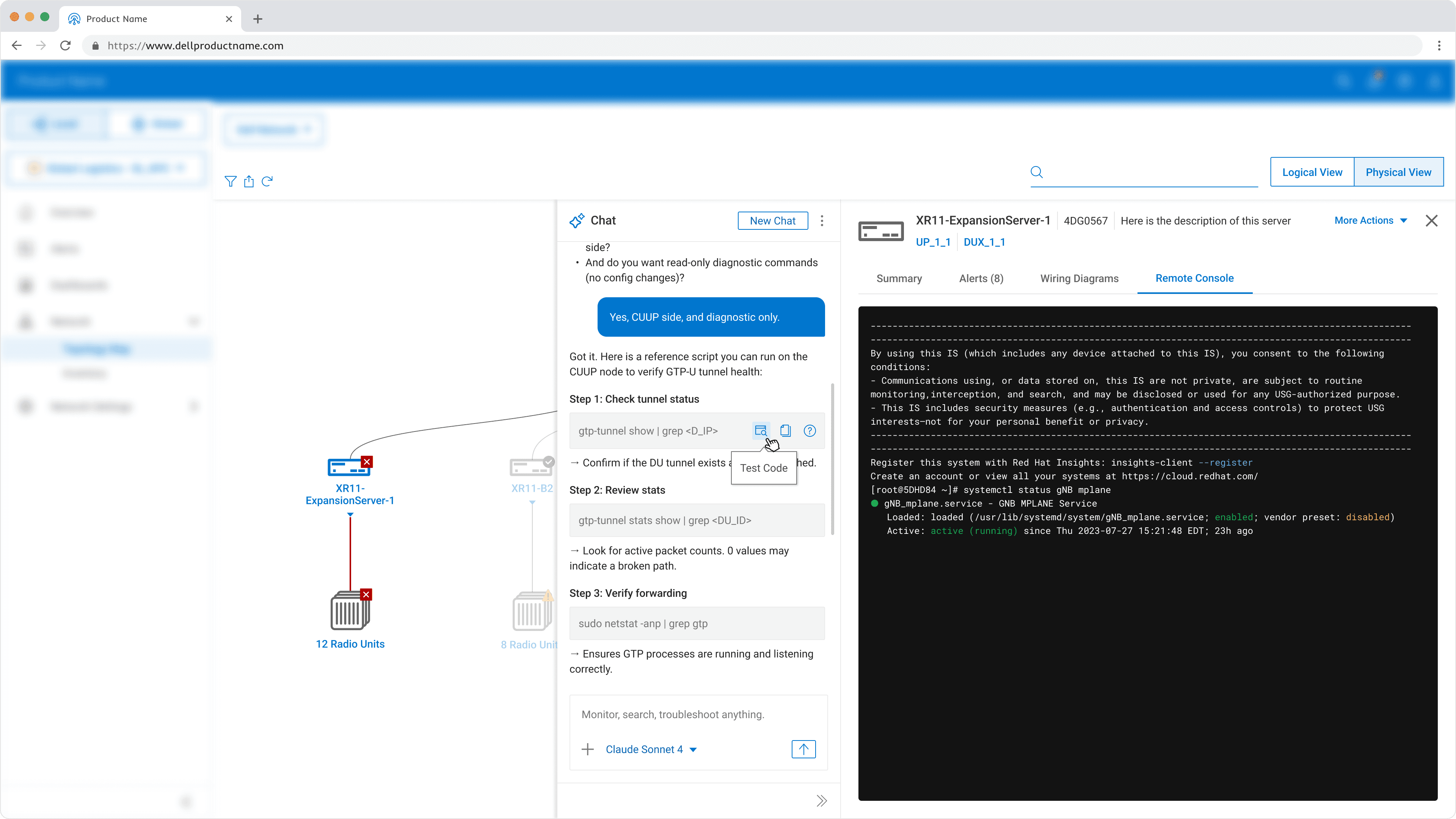
HMW Bridge the Gap Between GUI and CLI
HMW Bridge the Gap Between GUI and CLI
Future Exploration
Shell Integration
+
Smart AI Script Assistance
Future Exploration
Shell Integration
+
Smart AI Script Assistance
Future Exploration
Shell Integration
+
Smart AI Script Assistance
Bridge GUI and CLI
Lets users stay in the topology view while issuing and validating commands.
Bridge GUI and CLI
Lets users stay in the topology view while issuing and validating commands.
Bridge GUI and CLI
Lets users stay in the topology view while issuing and validating commands.
Upskill Non-experts
AI can draft command runbooks and explain parameters in plain language.
Upskill Non-experts
AI can draft command runbooks and explain parameters in plain language.
Upskill Non-experts
AI can draft command runbooks and explain parameters in plain language.
Improve Safety
Encourage a test-before execute workflow, reducing the risk of errors in live network environments.
Improve Safety
Encourage a test-before execute workflow, reducing the risk of errors in live network environments.
Improve Safety
Encourage a test-before execute workflow, reducing the risk of errors in live network environments.